
In a world where thousands of wines compete for attention on store shelves and digital screens, the wine label plays a surprisingly powerful role in guiding consumer choices.
While wine enthusiasts might rely on varietals, vintage, or appellation to make selections, many casual buyers often make snap judgments based on what they see on the bottle. In fact, studies have shown that a well-designed label can significantly increase the likelihood of a purchase—even more than the wine’s region or producer.
This article dives into why wine labels matter, how they influence perceptions, and what to look for (or watch out for) when selecting a wine.
1. The First Impression Factor
Walk into any wine shop, and you’ll likely be overwhelmed by rows upon rows of bottles. What catches your eye first? Probably the label. Whether you’re shopping in person or scrolling online, the label serves as the wine’s first impression—a visual handshake.
Many consumers, especially those without formal wine education, rely on this visual cue as a substitute for deeper knowledge. A label that evokes elegance, modernity, playfulness, or heritage can instantly appeal to different audiences.
Key takeaway:
Wine labels often act as proxies for quality in the minds of buyers, even if they have little bearing on the wine inside.
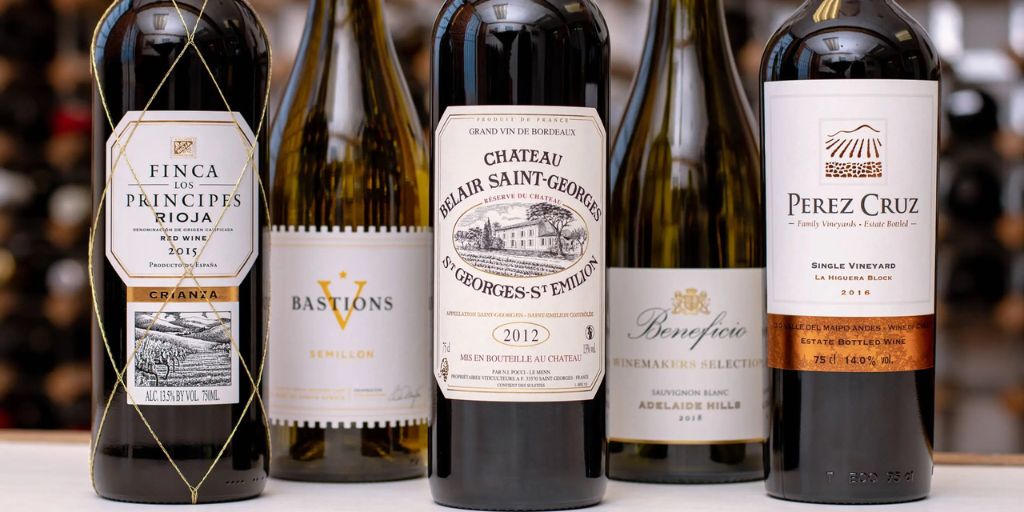
2. Design Psychology and Consumer Appeal
Wine labels aren’t randomly created—they are carefully designed using color theory, typography, layout, and emotional cues that influence consumer psychology.
-
Bold, minimalistic designs often suggest modern or “natural” wines.
-
Script fonts and crests may convey tradition and old-world sophistication.
-
Bright, whimsical artwork appeals to younger consumers or those looking for something fun or casual.
-
Black and gold labels are commonly associated with luxury or premium quality.
Even the choice between matte vs. glossy paper, foil accents, or embossing can convey prestige or trendiness.
Example:
A wine with a hand-drawn animal or quirky name might appeal to millennials seeking something Instagrammable, while a Burgundy-style label with serif fonts might draw in more conservative buyers who value legacy and history.
3. Use of Language: What the Words Say (and Don’t Say)
Beyond the visuals, the wording on a wine label also influences purchase decisions. Marketers know which phrases evoke quality or exclusivity.
Common phrases include:
-
Estate Bottled – suggests high-end, single-vineyard quality.
-
Old Vines – implies complexity and richness, even though “old” isn’t officially defined.
-
Reserve or Private Selection – often used loosely but sounds premium.
-
Limited Edition – plays into scarcity psychology.
However, some terms have legal definitions depending on the country (e.g., “DOCG” in Italy or “AOC” in France), while others are purely marketing fluff.
Buyers who don’t understand these terms may be persuaded by how a label feels, rather than what it factually guarantees.
4. Country and Region Cues
Some countries mandate very specific labeling regulations, while others are more relaxed. This difference can shape consumer trust.
-
Old World labels (France, Italy, Spain) often highlight the region over the grape.
-
New World labels (USA, Australia, Chile) frequently emphasize varietal and brand.
For instance, a bottle labeled “Chianti Classico DOCG” might confuse a novice who doesn’t know it’s made from Sangiovese, while “California Pinot Noir” is immediately accessible.
Consumers often associate certain regions with quality or personality—like assuming French wines are refined, or Australian wines are bold. Labels that spotlight these locations bank on those mental shortcuts.
5. Imagery and Iconography
Pictures of vineyards, animals, historical figures, or abstract art are often strategically chosen to tell a story or evoke a mood.
 How Wine Labels Influence Buying Choices
-
A bear on the label might suggest rustic boldness.
-
A castle drawing may hint at old-world heritage.
-
An abstract splash of color could suggest creativity or a modern winemaking style.
In many cases, the image connects to the winery’s identity or origin, but just as often, it’s chosen simply to stand out on the shelf.
6. Wine Labels and Gender Influence
Interestingly, several marketing studies have shown that label design may affect men and women differently.
-
Men are more likely to choose wines with bold fonts, darker labels, and minimalist design.
-
Women often prefer elegant fonts, softer color palettes, and detailed imagery.
Of course, these generalizations don’t apply universally—but they’re widely considered in marketing strategies.
Wineries trying to target a particular demographic might tweak label design accordingly, from naming conventions to color psychology.
7. Pricing Perception Based on Label Design
A fascinating study by Cornell University revealed that consumers often assign higher value to bottles with traditional-looking labels—like those with serif fonts, muted colors, and vintage-style layouts—even when the wine inside is identical to a bottle with a modern or quirky label.
Similarly, clean, minimalist labels with high-quality printing materials often lead people to believe a wine is more expensive.
What’s more, many people report that they enjoy wine more when they believe it comes from a prestigious-looking bottle—even if they’re drinking the same product in a blind tasting.
8. Misleading or Confusing Labels
Wine labels can sometimes be intentionally ambiguous or misleading. For example:
-
Terms like “Reserve” or “Old Vine” don’t guarantee any legal standards in many countries.
-
Some labels suggest the wine is from a prestigious region when only a small percentage of the grapes are.
-
Others mimic the look of renowned producers to confuse or attract unsuspecting buyers.
When buying wine, especially online, it’s important to look beyond the label and research the producer, region, and reviews when in doubt.
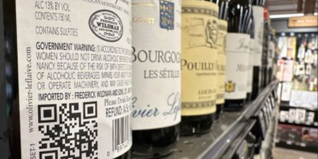
9. QR Codes and Interactive Labels
In the digital age, labels have started becoming interactive. Some include:
-
QR codes linking to tasting notes or vineyard videos
-
Augmented reality experiences (as seen in brands like 19 Crimes)
-
Food pairing suggestions printed directly on the label
These add a layer of engagement and encourage exploration, especially for newer wine drinkers who may be intimidated by traditional terminology.
Final Thoughts: Judge the Label—but Verify the Wine
There’s no denying the influence of wine labels on consumer behavior. From the font to the imagery, from the phrasing to the bottle shape, every element has been meticulously crafted to persuade you.
But while the label can tell part of the story, it’s never the whole truth.
Here’s how to balance looks with logic:
-
Let the label draw you in—but verify with reviews, ratings, or reputable sources.
-
Over time, track which label styles match the wines you enjoy—you’ll start seeing patterns.
-
When in doubt, go beyond the label and explore more about the producer, region, and vintage.
In the end, wine is as much about the experience as it is the content. The label is just the first step—but what’s in the bottle is what matters most.